Originally published in Forbes
This is the second of a three-article series covering the business value of predictive AI, using misinformation detection as an example for illustration: article 1, article 2, article 3.
Man, I wish I had a magic crystal ball. That would be handy.
Fortunately, we do have the next best thing: probability, the assignment of a number between 0 and 100 as to the chances something will happen. The means to calculate probabilities from historical data is machine learning. And the enterprise deployment of ML to improve operations with these probabilities is called predictive AI.
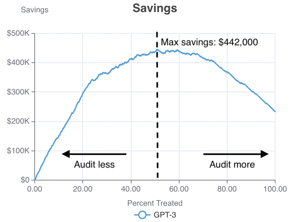
In my previous article, I covered one such use case: misinformation detection. I showed how, in predictively deciding which social media posts deserve an investment of human effort to audit, a social media company with a high-risk channel (one third misinformation) can navigate just how much money it could save. The savings curve looked like this (explained fully in this previous article):

A savings curve for misinformation detection. The horizontal axis represents the portion of posts manually audited and the vertical axis represents savings. – ERIC SIEGEL
There’s a reason we need to look at a curve like this rather than just a single number. You might be tempted to consider the maximum savings of $442,000 the only take-away you need. And that is an option indeed: If you set the decision threshold to 51%—as shown with the dotted line—then the model is estimated to save the company that much. With that setting, the top 51% most risky posts, those to the left of the dotted line, will be audited.
But there are other factors to consider. Take a look at the shape of the curve. If you moved the decision threshold to the right a bit—say, to 60%—you’d achieve a nice tradeoff: You would block more misinformation with only a very slight decrease in savings.
Another factor to consider might be the absolute count of mistaken flags, aka false positives. Every time a truthful post is flagged as potentially misinformation, there’s a potential downside—beyond the cost of having a human audit it unnecessarily. Suppose the system works as follows: When a post is flagged, it is suppressed at least temporarily until a human auditor screens it. That means the social media user must contend with an unusual delay for their post, as well as the feeling of being mistrusted. The further we move the dotted decision threshold to the right within the chart shown above, the more misinformation captured—but the more false positives incurred.
One more consideration could also be the total cost of the auditors. If the organization imposes a budget on the auditing team, that will mean only so many posts can be audited each week, so there’s only so far to the right you could position the decision threshold. For example, you may only be able to afford auditing the riskiest 20% of posts, in which case the 20% mark would be the furthest to the right you could go.
Finally, the steepness of the curve makes a difference. If the powers that be are imposing that 20% maximum, you might point out to them that the curve continues its steep upward trajectory until the 23% mark. This means you could continue to get that relatively high “bang for your buck” for a bit beyond the 20% mark, blocking misinformation and increasing your savings at the same high rate. This could convince your decision makers that it would be worth it to increase the budget that additional bit.
The entire curve matters. Only by viewing its swerves and bends from end to end can you consider all the available options and tradeoffs. Rather than only considering any one number in isolation to assess a model and determine whether and how to deploy it, your team must work with visuals like a savings or profit curve that convey the complete range of model-deployment options.
In a followup article, I’ll continue with this example to show how business factors that are subject to change or reconsideration—such as the value your company places on preventing misinformation, or on preventing whatever problem the project seeks to prevent—affect deployment decisions. As you’ll see, altering the settings for such factors changes the shape of the curve and therefore changes your options for deployment.
About the author
Eric Siegel is a leading consultant and former Columbia University professor who helps companies deploy machine learning. He is the founder of the long-running Machine Learning Week conference series, the instructor of the acclaimed online course “Machine Learning Leadership and Practice – End-to-End Mastery,” executive editor of The Machine Learning Times and a frequent keynote speaker. He wrote the bestselling Predictive Analytics: The Power to Predict Who Will Click, Buy, Lie, or Die, which has been used in courses at hundreds of universities, as well as The AI Playbook: Mastering the Rare Art of Machine Learning Deployment. Eric’s interdisciplinary work bridges the stubborn technology/business gap. At Columbia, he won the Distinguished Faculty award when teaching the graduate computer science courses in ML and AI. Later, he served as a business school professor at UVA Darden. Eric also publishes op-eds on analytics and social justice. You can follow him on LinkedIn.
The Machine Learning Times © 2025 • 1221 State Street • Suite 12, 91940 •
Santa Barbara, CA 93190
Produced by: Rising Media & Prediction Impact

Pingback: To Deploy Predictive AI, You Must Navigate These Tradeoffs - RevTech